Hello again, everyone. This is Melissa Strong bringing you the third installment of my Open Source series (you can read the previous ones here and here).
But first, an important reminder: the Open Visualization Academy (OVA), launches tomorrow! As you know, the OVA is a free educational platform about information design and data visualization; what you probably don’t know is that it was designed and built with open source tools including Django and Wagtail. This context matters, because the tools we choose reflect the values we are trying to teach.
Observable Plot fits squarely into that philosophy. It is not about novelty or technical bravado. It is about making good visual decisions easier to express, easier to read, and easier to share.
Observable Plot is a charting library built on top of D3.js. It relies on D3 for scales, layouts, and rendering, but exposes a higher-level Application Programming Interface (API) that removes much of the repetitive setup typically required when building charts from scratch.
It is declarative in nature. You describe what you want to show, and Plot handles much of the rest through sane defaults and sensible conventions.
Between “easy but limited” and “flexible but complex”
Visualization tools tend to fall into two camps, both with tradeoffs many of us have encountered before.
On one end, there are tools that are easy to use but boxed in. They offer a small set of chart types, a fixed menu of options, and very little room to adapt once the data or the story falls outside the template. They work well until they don't, and when that moment comes, one can feel stuck.
On the other end, there are tools that can do almost anything, as long as you are willing to define almost everything. These tools are powerful and expressive, but they demand constant attention. Every scale, axis, interaction, and layout choice becomes your responsibility. The flexibility is real, but so is the overhead.
Observable Plot sits deliberately in the middle. A happy medium.
It provides layered marks, composability, and expressive power without requiring every chart to be built from raw primitives. You can stay at a high level when it is enough, and drop lower only when necessary. In many cases, that drop is never required.
This middle ground is not accidental. It reflects a clear opinion about what most people actually need when working with data. Plot assumes that the goal is to make clear, effective charts efficiently, not to demonstrate technical prowess.

Demo heatmap showing site reachability I created while toying with Plot.
Why smart defaults matter more than flexibility
Plot’s defaults are not arbitrary, and that is one of the reasons it works so well in shared and educational contexts. Time behaves like time. Quantitative values behave like quantities. Axes and scales appear when they are needed and stay out of the way when they are not.
This has two important effects for teams, classrooms, and collaborative work.
First, it lowers the cost of doing the right thing. You do not need to remember which scale to choose or how to format ticks to avoid misleading precision. The library nudges charts toward reasonable choices by default.
Second, it makes charts easier to read in code form. A Plot chart often reads like a description of the visualization rather than a set of drawing instructions. Someone new to a codebase can understand intent without having to reverse-engineer mechanics.
That readability matters. It makes examples easier to teach, projects easier to maintain, and visual decisions easier to discuss.
Same data, default output
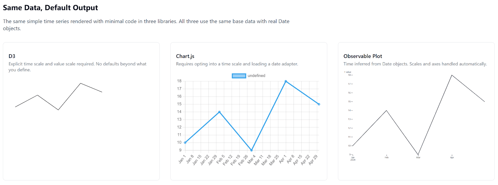
The contrast becomes clearer when we look at what each library produces by default, given the same data.

Comparing defaults using minimal code. D3 (left) 13 lines of code. Chart (middle) 11 lines of code. Plot (right) 6 lines of code.
The image above shows the same simple time series rendered three ways, using the same underlying data with real Date values. Nothing has been styled or normalized beyond what each library does by default. The differences you see are the defaults.
With D3, almost nothing appears unless you explicitly define it. Scales, axes, and layout are all your responsibility. The result is minimal and precise, but also intentionally bare. D3 gives you control, not opinions.
With Chart.js, you get a complete chart once time handling is enabled and a date adapter is provided. The output is not a refined visualization, but it is structurally complete. Many decisions are made for you, and those decisions are not always obvious.
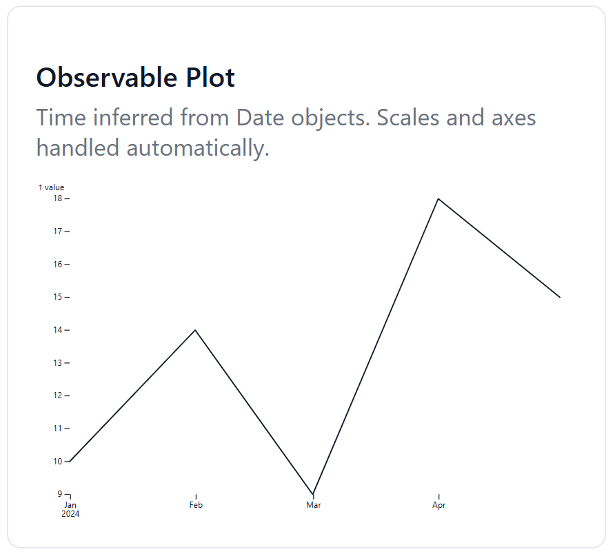
With Observable Plot, the chart emerges fully formed from the data itself. Time is inferred directly from the Date objects. Scales and axes are added automatically, and the result is readable without additional instruction. The chart reflects intent rather than implementation.
What matters here isn’t which chart looks best. It’s how much work is required to arrive at a clear, honest visualization, and how transparent that work remains to anyone who might be reading your code.
A natural fit for storytelling and education
For teaching data visualization, or for writing about data for a general audience, Plot is unusually well suited to the task.
Examples stay compact, charts can be explained without pages of setup code, and the focus stays on why a particular encoding works rather than on how it is glued together. Whether you’re illustrating comparison, change over time, or distribution, the chart supports the explanation instead of competing with it.

Simple timeline plot demonstrating defaults.

Code screenshot showing just a few lines to generate the simple timeline plot (above).
This also makes Plot a strong choice for narrative and editorial work. It integrates cleanly into modern web stacks, supports annotations and small multiples, and does not push interactivity just for the sake of having it. When your goal is understanding rather than exploration, that restraint is actually a strength. Less can be more.
Plot will not replace lower-level tools for every use case, and it does not need to. But for a wide range of charts used in teaching, research communication, journalism, and internal dashboards, it occupies a sweet spot that is surprisingly rare.
It’s opinionated without being rigid. Capable without being exhausting. In a crowded landscape of tools that either oversimplify or overwhelm, that balance is refreshing.
So, if you like to dabble (or more) in information design for the web, I highly suggest checking out this fairly new library. It will save you some sweat and tears.


